The cinematography and set design for the television show, I Love Lucy, revolutionized sitcom production in such a profound way. It's impossible to ignore the influence that it has had on television since the show debuted in 1951. So for a new film like Being the Ricardos, which shows the relationship between Lucille Ball and Desi Arnaz, it had to not only honor the original production and the filming techniques that were used but also modernize it in such a way where it feels current. What seemed like a difficult task ended up being executed to perfection by the film's Cinematographer and Production Designer.
In an exclusive interview with Interiors, we spoke with Jeff Cronenweth (Cinematographer) and Jon Hutman (Production Designer) for Being the Ricardos. The photos are courtesy of Amazon.
BEING THE RICARDOS (2021) CR: AMAZON
INT: You previously crossed paths with Aaron Sorkin on The Social Network. How did the opportunity to do this film come about? What was it about it that made you want to work on it?
Jeff Cronenweth: Aaron and his producer Stewart Besser reached out first with the script and then followed up with a zoom talk. We spent most of the conversation reminiscing and complementing our work since “The Social Network”. Then dove into the script, his vision and my questions. First and foremost, Aaron’s writing and the fantastic story he wrote about people and a show that we all hold so close to our hearts. Visually the script had so many challenges and opportunities I couldn’t wait to get started.
INT: Aaron Sorkin has said that he admired your work on Quiz Show and that he wanted Being the Ricardos to feel like Quiz Show in Hollywood. How did the opportunity to do this film come about? What was it about it that made you want to work on it?
Jon Hutman: I had worked with Aaron on “The West Wing,” 21 years ago. And he had asked me to do an earlier version of “Chicago 7,” which didn’t happen. So we had worked together successfully in the past.
Stuart Besser, the line producer who’s worked with Aaron three times now, called me, and kind of down-played the job—he thought I might not be interested in recreating sets which had already been designed. (Which I think was his way of hooking me into the job…)
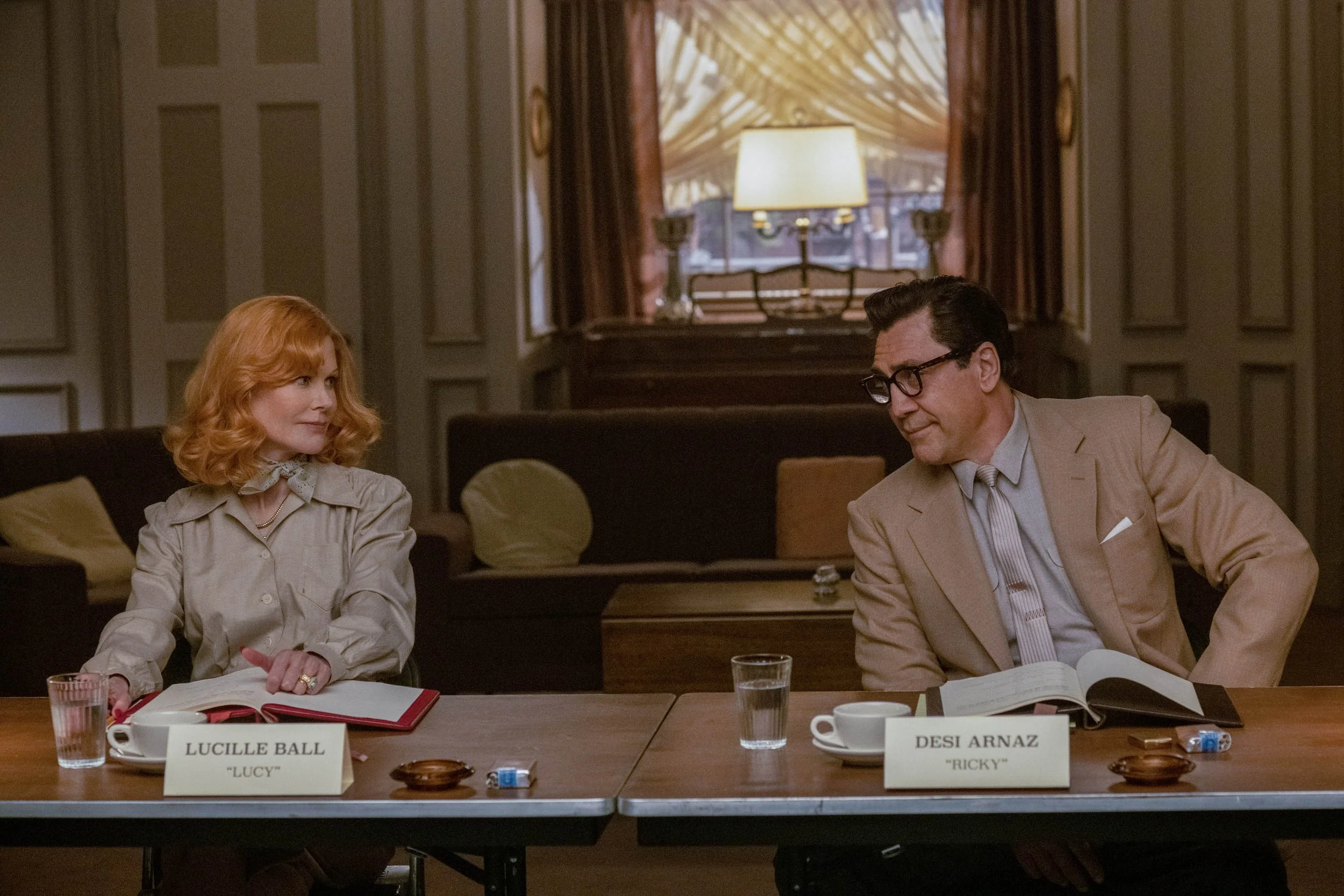
I’m a huge fan of Aaron’s writing, and when I read the script, I could see the world as he described it, and it made me want to explore and help him define that world. Production design, even on a historical feature, is about creating the world in which a story takes place. My job is very much like the writer’s job—to explore reality, and then reinterpret it so that it best helps the director tell the story. For example, Charles Koerner’s office (the president of RKO), has the impressive grandeur suitable to the scene in which Lucy, having just received great reviews for her latest role, gets released from her contract.
BEING THE RICARDOS (2021) CR: AMAZON
BEING THE RICARDOS (2021) CR: AMAZON
BEING THE RICARDOS (2021) CR: AMAZON
INT: I Love Lucy was an iconic show for many reasons, including the fact that it changed sitcom production with its cinematography. How much of that were you aware of going into the project, and what was the research process like when you studied the camera setup that cinematographer Karl Freund and Desi Arnaz pioneered?
Jeff Cronenweth: I was aware that they had come up with a lot of firsts for the show but was unaware of the degree of obstacles they had to overcome and how much technology originated from the “I Love Lucy” show. First Karl Freund was an acclaimed cinematographer who garnered an Oscar in 1937 and another technical Oscar in 1955 for the incandescent light meter. Conceiving and lighting for three camera setups while not blocking the audience, headsets to the operators and dolly grips, quick changes, dealing with contrast levels of 2:1 and the Kinescope, watching dailies with a 3 moviola setup so Desi could watch back all three cameras at the same time and the list goes on. The true compliment to their achievements is that they are shooting sitcoms the same way.
INT: I Love Lucy is an iconic show. Can you talk about the set? How faithful did you want to be to the actual set?
Jon Hutman: We reproduced the “I Love Lucy” set pretty faithfully. Except the version we recreated wasn’t actually the version on which the episode “Fred and Ethel Fight” (depicted in the film) takes place. We chose the later (more familiar) version of the set because we wanted to have a window in the middle of their living room.
One of the challenges of recreating that set was to choose desaturated colors which give the audience the familiar feeling they have of experiencing and remembering the set in black and white. Aaron has also said that he loved the backstage areas of the set which we created and dressed. Both on the stage, and in the offices, workshops, and dressing rooms behind the scenes.
BEING THE RICARDOS (2021) CR: AMAZON
INT: Aaron Sorkin has said that he didn't want any gimmicks in this film, and that it was important for him to feel like the film was made today instead of in 1952. You have also said that The Social Network was a reference point that Aaron Sorkin used in your first conversations about Being the Ricardos, such as how you would utilize different compositions and shifts in character staging, instead of the usual walk-and-talk shots. Can you talk about those early conversations and how you both developed the look of the film?
Jeff Cronenweth: The references to “The Social Network” revolved more about the bold visuals and camera movement that David Fincher and I have embellished over the years. Aaron wanted every department to push him beyond his comfort zone in all aspects including with light and camera movement. His scripts are so tightly constructed with overlapping dialogue that it would be easy to get caught up simply watching the actors deliver the words. We only had a few scenes that accommodated long walk and talks so we would simply work with the cast when blocking to keep them moving within a room forcing the camera to accommodate.
INT: How did you and your team go about making the set feel so close to the original?
Jon Hutman: Art Director Andres Cubillan and Set Decorator Ellen Brill both meticulously studied the voluminous reference compiled by researcher Deidre Backs. Teams of shoppers, set designers, carpenters, and painters worked together to realize and authentic version of the set. We even framed the back sides of the flats with larger dimensioned lumber which would have been accurate to the period.
BEING THE RICARDOS (2021) CR: AMAZON
BEING THE RICARDOS (2021) CR: AMAZON
BEING THE RICARDOS (2021) CR: AMAZON
INT: Did your grandfather's (Edward Cronenweth) work influence you in any way on this film in particular, especially the film's flashbacks set in the 1940s, a time when he was a notable photographer in Hollywood?
Jeff Cronenweth: I had the opportunity to visually define 3 different eras: the ’50s that was the week the story takes place and included Lucy’s internalizing of the I Love Lucy show in B/W, the ‘90s where the interviews took place and the ‘40s when Lucy and Desi first met. I love the starlight fashion noir that photographers used in the ’40s including my grandfather and his peers like George Hurrell and I thought it would be fun and defining to embrace their style. Very glamorous backlight and perfectly placed slashes seemed appropriate for the courtship ballet.
INT: Aaron Sorkin has said that you both had discussions about making an undressed stage/set - which most of the time would consist of work light and naked bulbs - feel beautiful. Can you share more insight on this?
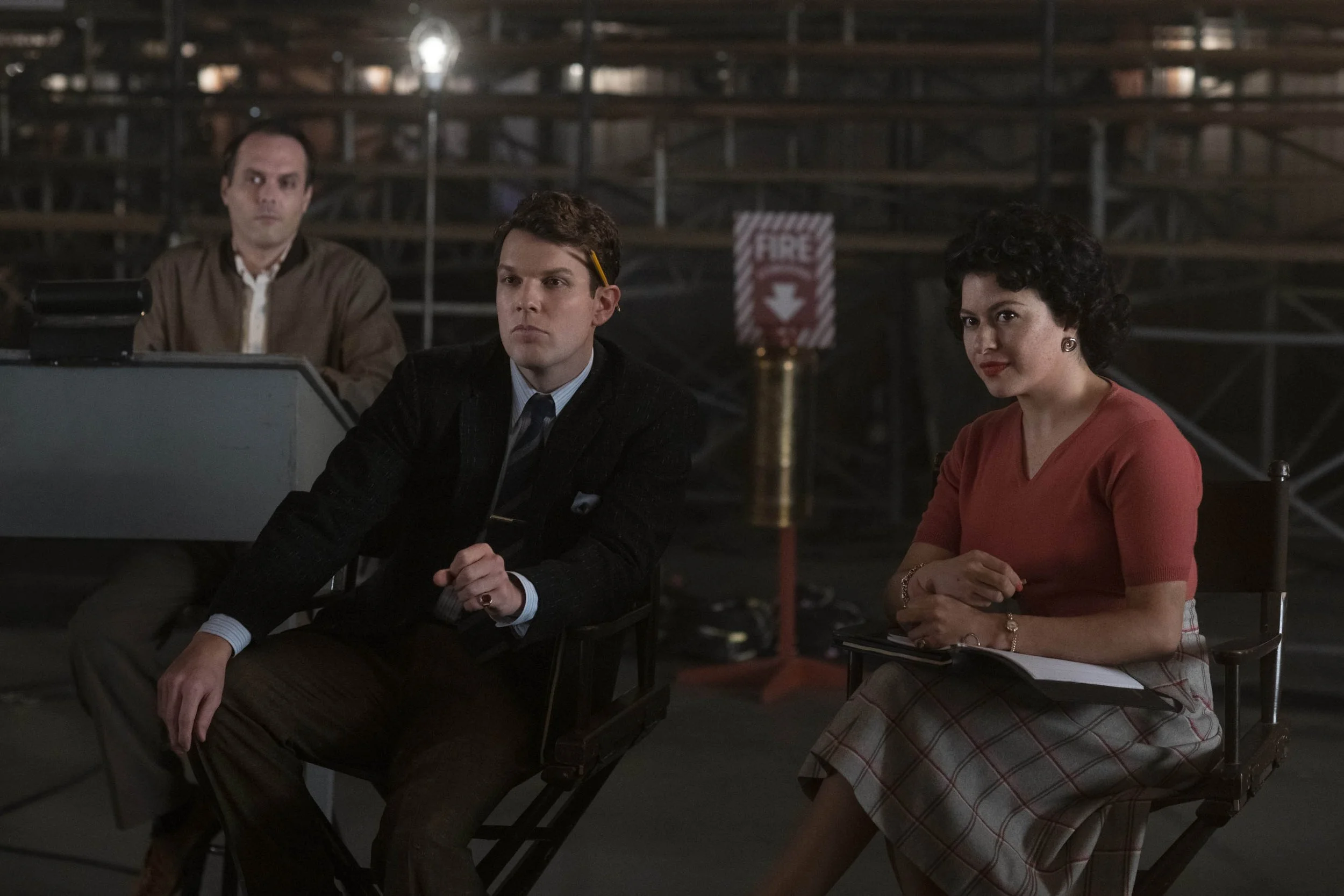
Jeff Cronenweth: I think it was imperative to show the reality of a working stage in contrast to the comfort and beauty within the set. After all, it’s in that room that Lucy has created the world she has always longed for but outside of that set sits reality. Light bulbs are a beautiful source but are raw and simple. I wanted the audience to appreciate scale to define the space and then let a shallow depth of field isolate the actors and work lights and bulbs to help further that integrity.
BEING THE RICARDOS (2021) CR: AMAZON
INT: Your work goes hand-in-hand with production designer Jon Hutman, who we are also interviewing for this piece. You are known for your preference of "blowing out windows" which is now being referred to as "Cronenwindows." This led Jon Hutman to provide you with larger windows to work with. The episode in question in the film ("Fred and Ethel Fight") is from the show's first year, but in the film, we are introduced to the show's later set, which was introduced in season two. Is this because you wanted to utilize the window in the living space? If so, can you share what it is about large windows and vast amounts of light that you have a preference for, especially for a story like this?
Jeff Cronenweth: The timeline in the script is condensed from reality and those B/W scenes are only in Lucy’s mind but yes, we decided that the majority of the show's run had a window and that it would be far more interesting to look at than another flat wall. I really didn’t utilize it for light but we did have a painted backdrop outside for perspective. As for windows in general it seemed right to utilize natural sources when possible grounding the visuals and offsetting the other eras and the B/W footage.
INT: The episode in question in the film ("Fred and Ethel Fight") is from the show's first year, but in the film, you utilize the show's later set, which was introduced in season two. Is this because you wanted to utilize the window in the living space? If so, why?
Jon Hutman: Yes. Basically, because it looks better visually, and photographically, and gives depth and focus to the set. (Probably the same reason which they redesigned the actual set for season 2 of the show!)
Jeff Cronenweth is a Cinematographer and has worked on various Film and Music Videos.
Jon Hutman is a Production Designer and has worked on various Films, Television Shows and Commercials.


