
David Fincher’s Mank (2020) depicts 3 incredibly unique locations in California with a multitude of interior and exterior architectural spaces. The visual presentation of the film, combined with the Art Direction and Set Decoration, creates a masterful, multifaceted level of Production Design that is rarely seen in cinema. It is a film that warrants multiple viewings and its attention to architectural details should be commended.
In an exclusive interview with Interiors, we spoke with Donald Graham Burt, who is the Production Designer for Mank.

Production stills courtesy of Netflix
INT: You're a longtime collaborator of David Fincher's but what was it about Mank specifically that interested you in taking on the project?
DGB: First and foremost it was an opportunity to work on a project that was a period Los Angeles project - and even more specifically a period project about the film industry. To be able to delve into the history of the studios and the roots of the industry in its early years in Los Angeles - when portions of the city were still undeveloped - was an experience to cherish. David’s projects are always of high caliber and there is a professional level at which he works that is rewarding to be a contributor to.
INT: Mank is masterful in how it depicts the time period between 1934 and 1940. Were there any references (cinematic or historical) that were exceptionally helpful during the process? You've said you watched films like Double Indemnity and studied documents at the Motion Picture Academy’s Margaret Herrick Library in Beverly Hills. What did you discover or learn during this process?
DGB: I watched films and studied research photos of the period to get a sense of the city, the studios, and the culture of the period. I watched films including SUNSET BOULEVARD to DOUBLE INDEMNITY and many others between primarily to harvest any visual information about the city streets, neighborhoods, studios, and vehicles just to begin to experience the period. And although some of the films were made after the timeline for MANK, there were pieces of information that were helpful. For instance, SUNSET BOULEVARD has scenes in and around the Paramount Gates which was good reference since we too had this locale in our film. So any films were not viewed with the pretense of it representing a look - more for visual detail references.
The still photos of the period were probably the most helpful. The Academy Library has a large collection of stills of the studios - particularly MGM - that provided wonderful visual reference. The library also has original documents penned by studio executives of the period as well as Mankiewicz. The Los Angeles DWP also has a historical collection of photographs that were instrumental in researching details of the city for the period - elements such as traffic signals, street signs, etc. It has wonderful references to early signage and neighborhoods.
I probably learned the most just by reading the various books written about Hollywood during the period. The process of filming and the physicality of filming, the authoritarian power of Mayer and Thalberg, the vices of people in the industry, the obsession with control and profit and success by studio heads - all of which were woven into the industry from its genesis.
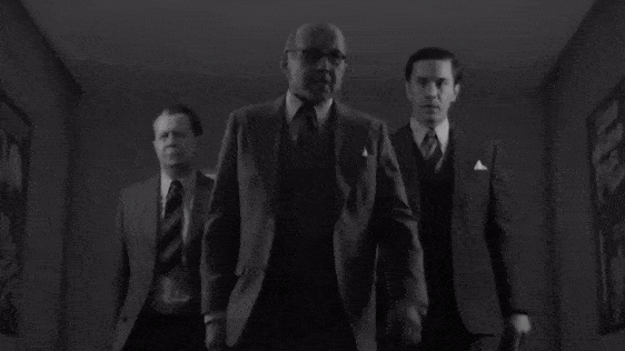
Production stills courtesy of Netflix
MANK (2020)

MANK (2020)

MANK (2020)
INT: The film captures 3 different areas (Guest Ranch, Hollywood and Hearst Castle), all of which are distinct and feature captivating interior and exterior spaces. Knowing that the structure of the film would be going back and forth between these areas, did that impact any spatial decisions or influence any architectural aspects?
DGB: Hollywood was portrayed primarily by the studios both interior and exterior. We wanted MGM to feel the most successful as indeed it was, so we designed its interiors with Moderne Deco styling. Paramount was more of a worn feeling - especially in the writers rooms where you can see the contrast between the two - the Paramount writers room being more traditional and worn and the MGM being more stylized and streamlined. The same holds true for the offices with a contrast of the more traditional for Selznick at Paramount to the more streamlined for Mayer and Thalberg at MGM.
Production stills courtesy of Netflix
The Guest Ranch was the isolated desert quarters where Mank was sequestered to scribe Citizen Kane. It wanted to have a dusty, remote feel and be reflective of a type of desert Territorial architecture that incorporated adobe blocks with heavily plastered adobe walls for the interior. The actual location still exists and with a great deal of cosmetic work we filmed exteriors on the actual site. The interior was built as a stage set and incorporated elements and the architectural language from the location reconfigured with creative license to serve our narrative and accommodate our filming.
San Simeon (Hearst Castle) was quite the contrast to both Hollywood and North Verde Ranch in that it represented the indulgence of William Randolph Hearst with influences architecturally of Spanish Colonial Revival, Gothic and Classicism all converging to make his personal haven.
From the start, the film broke down into three visual locales - Hollywood - and in particular the studios with their contrasts - and the two outlier locales of North Verde Ranch and San Simeon with their specific styles.
INT: How did the presentation of the film (black and white) influence the production design? What was your collaboration with cinematographer Erik Messerschmidt like?
DGB: Erik and I had worked together before so we were able to discuss and test colors that we were thinking of utilizing for sets. In researching and testing I found that, quite truthfully, various mustards and violets lended themselves to black and white quite well. However, I just couldn’t imagine building sets in these carnival colors that would make the talent feel displaced so we worked to find neutrals - grays, warm grays, beiges and browns that would photograph well in black and white to keep a realistic natural feel to the scenery.
3D Model by Daniela Medeiros
Production stills courtesy of Netflix
Production stills courtesy of Netflix
INT: You mentioned in a recent interview with Variety that the approach for San Simeon was “about emulating instead of replicating”, which is not only relevant for a film like Mank, but for many cinematic and architectural fields. What was the process like emulating the Hearst Castle and was there something significant that you took from this exercise?
DGB: San Simeon, especially the interiors, was the greatest challenge. We researched extensively and I primarily relied on the period photographs we sourced of San Simeon if for no other reason it felt more complimentary to do so for a period project and portrayal. I purposely didn’t want to visit the current day Hearst Castle and just worked off of studying images and took notes of the prevalent elements that are part of the architecture and design. It was important to represent the collision of styles in the interior as well as incorporate specific elements such as grand fireplaces, carved woodwork, Gothic tracery, stone flooring and an overall sense of grandeur. Our design of the dining room and assembly room in particular reflected the rectilinear layout of the real San Simeon and we dressed our set with similar tapestries, dining table and chairs to give the feel of the actual space. It would be virtually impossible to replicate the actual San Simeon interiors with all of the detail and staff work from artisans of an era of such craftsmanship (the San Simeon dining hall was actually a monastery in Europe that Hearst purchased and had shipped and reassembled to create the room) and we certainly did not have the time or budget to do this so it was an approach of studying and simplifying the elements needed to reflect the actual space and then building detail within the simplified approach. I always feel it is important to keep it simple and then build complexity within the simplicity.
drawing by T.Lee
INT: There are several sets that utilize layers of depth– specifically, the dinner party as several characters interact with one another, talking about everything from politics to movies. Can you talk about the use of depth when creating sets?
DGB: Depth is usually always desired when designing sets. With the San Simeon dining hall it was important to serve the notion that there was more to the compound than just this room so that there are architectural layers in the story as well as dramatic layers.
Production stills courtesy of Netflix
Donald Graham Burt is a Production Designer and has worked on various Films and Television Shows.