INTerview: Daniel Rich
/It is hard not to get transfixed on the Art of Daniel Rich. Amazing, Intricate, Architectural works of Art that tell a story. His work looks at political and social narratives transcribed in the built environment. Whether it's political power structures, failed utopias, or politics, Daniel Rich has managed to create Art that is multifaceted and meaningful.
In an exclusive interview with Interiors, we talked to Daniel Rich about his art and his inspirations. All images are courtesy of the Artist and Peter Blum Gallery.
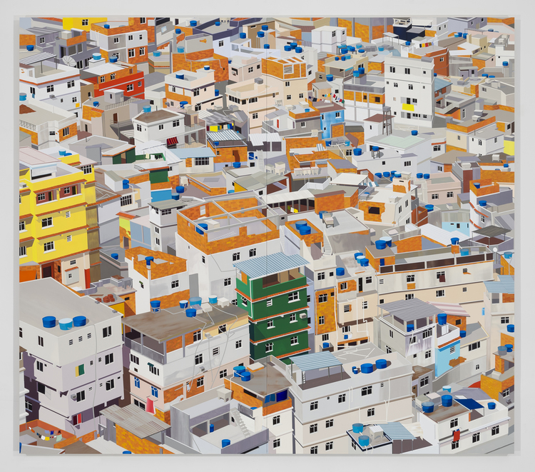
Favela, Rio de Janeiro, 2014.
INT: Your work is very much influenced by Architecture and the Built Environment. Has this always been a source of inspiration for you? Or did that develop over time?
DR: I grew up in Southern Germany towards the end of the Cold War and I distinctly remember watching the fall of the Berlin Wall on television. The events surrounding the collapse of East Germany and the Soviet Union really caught my attention at the time- I was only 12, but I realized there had been a seismic shift in the country’s political and social reality. In retrospect, these events had a profound impact on my perception of the world and made me aware of historical legacies and symbolism inscribed in the built environment around me.
I did not seriously set out to become an artist until I was 20 years old and when it came to subject matter, I automatically turned to architecture and history. My early work during my undergraduate studies revolved around the passing of time as it related to place. It was very nostalgic and I was heavily influenced by skateboarding and graffiti culture, which gave me a different kind of appreciation and awareness for the built environment.
I was in my second week of graduate school on September 11th and happened to be struggling with conceptual and aesthetic aspects of my work. My painting was heavily reliant on geometric abstraction and the events on and after September 11th directed me towards painting architecture more realistically. During this time I began appropriating photographs found in the news media and online in response to radio and TV broadcasts, and through research and reading. I realized that pictorial architecture allowed me to introduce a dialogue about changing political power structures, (failed) utopias, the impacts of ideological struggles, war and natural upheavals.
Hong Kong, 2013.
INT: You mention on your Website that your work calls “attention to implicit political and social narratives transcribed in the built environment”. Can you talk about this process? Does it start as an idea and then transform into the image? Or do you see the image first and start to build the meaning and symbolism? Can you give us an example of the process for a particular painting?
DR: I always work from photographs and my ideas for paintings most often occur with a specific event that I read or hear about in media coverage. A painting that is a good example is “Obama’s Visit to Baghdad” from 2008. The painting is based on a photograph that appeared on the cover of the New York Times in 2008 of then presidential candidate Obama and General Petraeus looking out of a helicopter window while flying over Sadr City in Baghdad.
The photograph read to me like a staged election campaign photo. I wanted to shift the focus and narrative of the image to the view out of the window. What appealed to me about cropping the image and the resulting composition, was the concept of painting as a window and the potential divergence and duality of the image.
Guangzhou Circle, China, 2015.
Obama's Visit to Baghdad, 2008.
INT: The topics of your work range from a large urban cityscape to an architectural detail. Is there a particular topic that you enjoy creating more than another? Or is there a particular symbolism that you enjoy examining?
DR: I like “mixing things up” in my work and try to always expand my range of subjects- architectural façades like the strip mall in Dubai, the “Large Hadron Collider”, iconic buildings such as the “Guangzhou Circle” or the “Torre Velasca” in Milan, interiors such as the “Pyongyang Ice Rink” or “Dreilinden”, Favelas in Rio de Janeiro or urban density of Hong Kong… What matters to me is the potential of the image to convey or reflect layers of meaning to the viewer.
Choosing source material is a very intuitive process and there is a certain excitement I feel when I find an image that guides me towards the making of a new piece. Mediating the image from a photograph into a painting is a process of editing, de- and reconstructing the image and working with color.
I don’t have a preference for one subject over another- it mostly depends on what I am thinking about or what is happening in the world on any given day. I see my role as an artist to distill certain moments in time by making paintings that reference or reflect on specific political, economic and social conditions and circumstances as they occur. I have come to see my paintings as portraits- I just choose to paint the built environment instead of people.
Pyongyang Ice Rink, 2015.
Dreilinden, 2010.
Sheikh Zayed Road, Dubai, 2016.
INT: You describe your interest in the “potential divergence and duality of images” and I’m curious if you’ve ever thought about experimenting with depicting film locations or scenes in your work?
DR: I think my work has a certain cinematic quality- the viewer is always alone in the painting as I do not include the human figure and this has the potential to turn him or her into the subject of the painting. I think I am very influenced by film as I “consume” more of the genre than other art.
I enjoy the uncanny and mysteriousness in the images I create. I love Alfred Hitchcock’s films, especially “North by Northwest” and “Vertigo”, Werner Herzog’s “Lessons of Darkness”, Kassovitz’s “La Haine” and Orson Wells’ “Citizen Kane”. What has always drawn me to painting architectural subjects is the idea that architecture is the backdrop to human events. It would be interesting to investigate theatrical backdrops, movie sets and film locations as subjects for paintings.
CERN (Large Hadron Collider), 2014.
INT: Your work is so captivating and seems to tell a story. It’s incredible how you are able to blend Art, Architecture, Symbolism and Politics in such a beautiful way. Where do you see your art going? Do you have any goals in terms of work you’d like to do and projects you’d like to try?
DR: I have been thinking more and more about working with series of images- making different versions of the same image and adjusting the light in the paintings for example. I think there is a lot of potential for creating narratives through the manipulation of color such as working with monochrome or subtle color palettes. I would also like to scale my work up to murals and approach mural and exhibition locations as site-specific installations.
I have been creating more of my own source material for paintings recently and could see myself branching out to photography or documentary film making in the future. For now, I am content with my practice but I think it’s important to always challenge the way you see and approach your work so you can develop new ideas and don’t allow things to stagnate.